

In this article, we are going to define what a call to action actually is and how best to use it on the website homepage.
Let’s start with defining what is a ‘call-to-action?
“A call-to-action is defined as the act of persuading someone or getting someone to perform an action you want them to on the website homepage.”
A call-to-action is an essential part of the design on the website homepage and is normally in the form of either a button or text link to encourage visitors to take the desired action required.
The purpose of a website homepage is to encourage the prospect to move one step closer to moving through the funnel, or the customer journey, of the business. That action could be any one of the following as examples:
- Clicking through to a second page eg about page, services page, blog article
- Clicking through to sign up to receive regular emails
- Sign up for a lead magnet download
- Click through to a contact page to submit a message through a contact form
And even…check out the business on social channels as part of due diligence and getting to know the business in the wider online space (although preferably these will be located in the footer section so as not to encourage visitors to leave the website too soon).
Deciding on the best call to action on the homepage
In order to create a call-to-action on the homepage, you need to first identify what you want the desired action to be. For example, if you want visitors to sign up for email updates then this is the type of action that should be encouraged with a button or link.
When using the Power of 3, as a way to guide a buyer’s decision, each option should have a call to action to tell the web visitor what it is they need to do next.
For example:
Service 1 – book a call
Service 2 – find out more by signposting to a further page for detail
Service 3 – signpost to a signup page for booking and payment or purchase
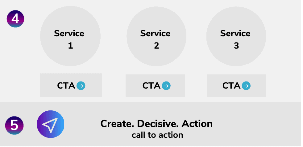
Once you have identified what the call to action priority is to be, the next step is to decide on the best place on your homepage for them to take this action. In the example above this would go directly underneath the service options or types themselves as shown in the diagram above.
Even if you incorporate calls to action as shown above to lead through to specific services or options, you can still include other calls to action but be careful that you keep it specific and do not include too many.
For example, on my homepage, I have 3 ways of working with me with each having a call to action.
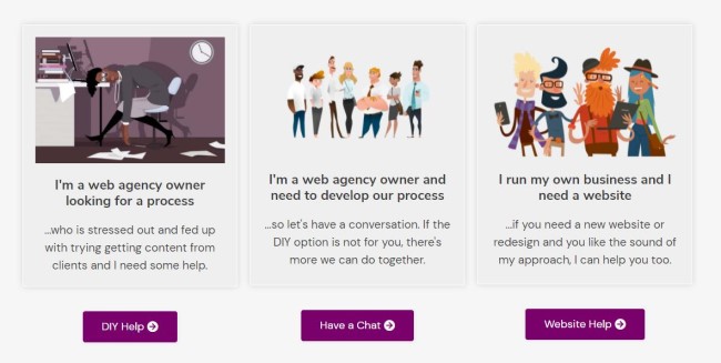
However, I also have the main call to action which is to download the lead magnet which requires less of a mental ‘commitment’ than clicking through to a further service page.
These two types of calls to action can work very well and be perfectly balanced within the context of the homepage. Any further options could become overwhelming and create inaction because of indecision.
Too much choice = overwhelm and inaction.
Limited choice = easy decision, takes action.
Placing the call to action
There are a few things to consider when choosing the place for your call-to-action such as:
Is it too close or far away from where a user is looking?
Are there other elements around this area that could be distracting, such as navigation items, search bar, or something else?
Does it stand out well enough against its surroundings?
Will people know that this is meant to be an action button because of how it looks or what text is next to it. This might sound like common sense but often I see call-to-actions with a ‘learn more’ message on them rather than a specific and direct action request.
Create. Decisive. Action
It is important to tell visitors specifically what their options are or the action they need to take. Make sure important information and signposting are not buried lower down on the homepage.
Keep the call to action clear and unambiguous by using precise statements to signpost the action encouraged such as:
‘Book now for next week’s conference’,
‘Subscribe to our newsletter today and stay up-to-date with the latest developments, or
‘Contact us by email.’
Having a clear call to action is crucial because visitors will not know what they are supposed to do unless you tell them.
It can be tempting, especially when marketing new products or services, to include too many options on your homepage so that every visitor feels compelled to find out more about everything. However, this clutters space and reduces the clarity of the action you want them to take, and has the opposite desired effect.
Signposting the way
If you’re not sure what to put on your homepage, try including a ‘How it Works’ section that explains the product or service in detail. This can also be an effective way of answering visitors’ questions and concerns before they have even asked them.
The call-to-action should be visible from the page’s fold (the part of a web page below which there are more scrolling options) so it is clear to all users who scroll down how to take action using text links, images or buttons.
Keep it clear and simple
One of the biggest mistakes to make is to have too much choice and too many options.
When faced with having to make a decision with many options, a web visitor is more likely to feel overwhelmed and make no decision at all and leave the website.
For example, on this website homepage, my main call to action is for people to download my lead magnet, The 8 Homepage Fundamentals, because it’s the first stepping stone to them coming into my funnel.
When signing up to receive the download via the lead magnet, it gives people the most value in exchange for a small commitment of their email address. They can unsubscribe whenever they want so it’s not an ‘all in’ decision but a small commitment nevertheless.
But it’s a quick and easy decision because by asking if they want the download or not, it requires a simple ‘yes’ or ‘no’ answer.
This is an easy decision and action is taken without much thinking effort.
From my point of view, I only want someone to download it if they think it will be helpful and would not want to waste someone’s time if it’s not. Then it’s a win-win for everyone.
Don’t Just Say it Once
The call to action, the same one, should be repeated throughout the rest of the homepage at appropriate points and as a final call to action towards the bottom of the homepage.
By repeating the call to action multiple times, it serves as a reminder to them and you are giving them more opportunities for conversion.
It also makes visitors think about what your offer is when they see it again because now their minds have been refreshed and they’re ready to make a decision on what’s being offered and it means they don’t have to scroll all the way back up towards the top of the homepage to find it.
In Summary
So let’s recap on the main point of implementing calls to action on the website homepage.
- Make sure any calls to action on the homepage are clear and easy to understand and that it conveys what is being offered without any complexity or risk of misinterpretation.
- The call to action should be repeated throughout the page at appropriate points for maximum conversion potential but do not over-repeat too much or visitors will find this off-putting.
- Implement a specific and focused call to action on the homepage and reap the benefits of improved conversion rates.
- Keep the calls to action clutter-free in their surroundings and easy to distinguish from other parts of the homepage eg a defined button in a different colour to the body text.
- Most importantly, encourage your calls to action to create users to take decisive guided action.
If you would like to find out more about the 8 Homepage Fundamentals to help with your web projects then you can download your copy of the guide below.